ana pryor studio
Brand style guide
The visual and verbal system behind the studio — colour, typography, imagery and tone — gathered in one place.
/ Brand essence
Don't just do good design. Do good.
Culture.
Work rooted in music, art and community, created with the people it represents.
Community.
Collaboration over competition — working alongside and across with like-minded people.
Sustainability.
Ethical, inclusive practice that aims to leave a positive, lasting impression.
/ Colour
A warm, print-like palette: deep ink, warm paper and one loud signature orange. Neutrals do the quiet work; orange does the talking.
Ink
#171613
Primary dark. Body text, wordmark, footer and deep hero sections. A warm near-black, never pure #000.
Paper
#F4F0E7
Primary light. Page background and large open surfaces. A warm off-white that keeps the brand feeling printed, not digital.
Orange
#FF493D
The signature accent. Statement sections, primary buttons and selection highlights. Always paired with Ink text, never white.
Lime
#E9E3D8
Secondary neutral. Quiet panels and supporting surfaces between Paper and Ink moments.
Soft
#DDD8CF
Muted neutral for borders, dividers and subtle separation on light backgrounds.
Line
#393731
Dark neutral for hairline rules and dividers on Ink sections.
/ Typography
One family does everything: Manrope, with Arial as the system fallback. Light weights carry headlines, Medium carries labels, Extrabold is reserved for the wordmark. Headlines always use tight negative tracking.
Display
Do good
Manrope Light. Hero headlines, clamped fluid sizing, very tight -0.065em tracking, 0.9–0.95 line height.
Statement
Good design with more heart.
Manrope Light. Large editorial statements inside sections.
Wordmark
ana pryor
Manrope Extrabold. Always lowercase, ultra-tight tracking, followed by a small superscript ®.
Body
I create solutions to make a difference.
Manrope Regular. Generous 8pt-equivalent line height for comfortable reading.
Label
PACKAGING & BRANDING
Manrope Medium, uppercase, wide tracking. Section eyebrows, menus and meta information.
/ Wordmark
The wordmark is typeset, never redrawn. It appears in Ink on Paper, or Paper on Ink, and only rarely on Orange.
ana pryor®
Always lowercase.
Never capitalised, never condensed, never re-spaced.
Room to breathe.
Give it clear space on all sides; it is oversized and confident, never cramped.
Registered mark.
The ® sits small and superscript after the name at large display sizes.
/ Imagery & photography
Photography is warm, human and tactile. Images are full-bleed and cropped like editorial spreads — never floated in boxes with heavy borders.
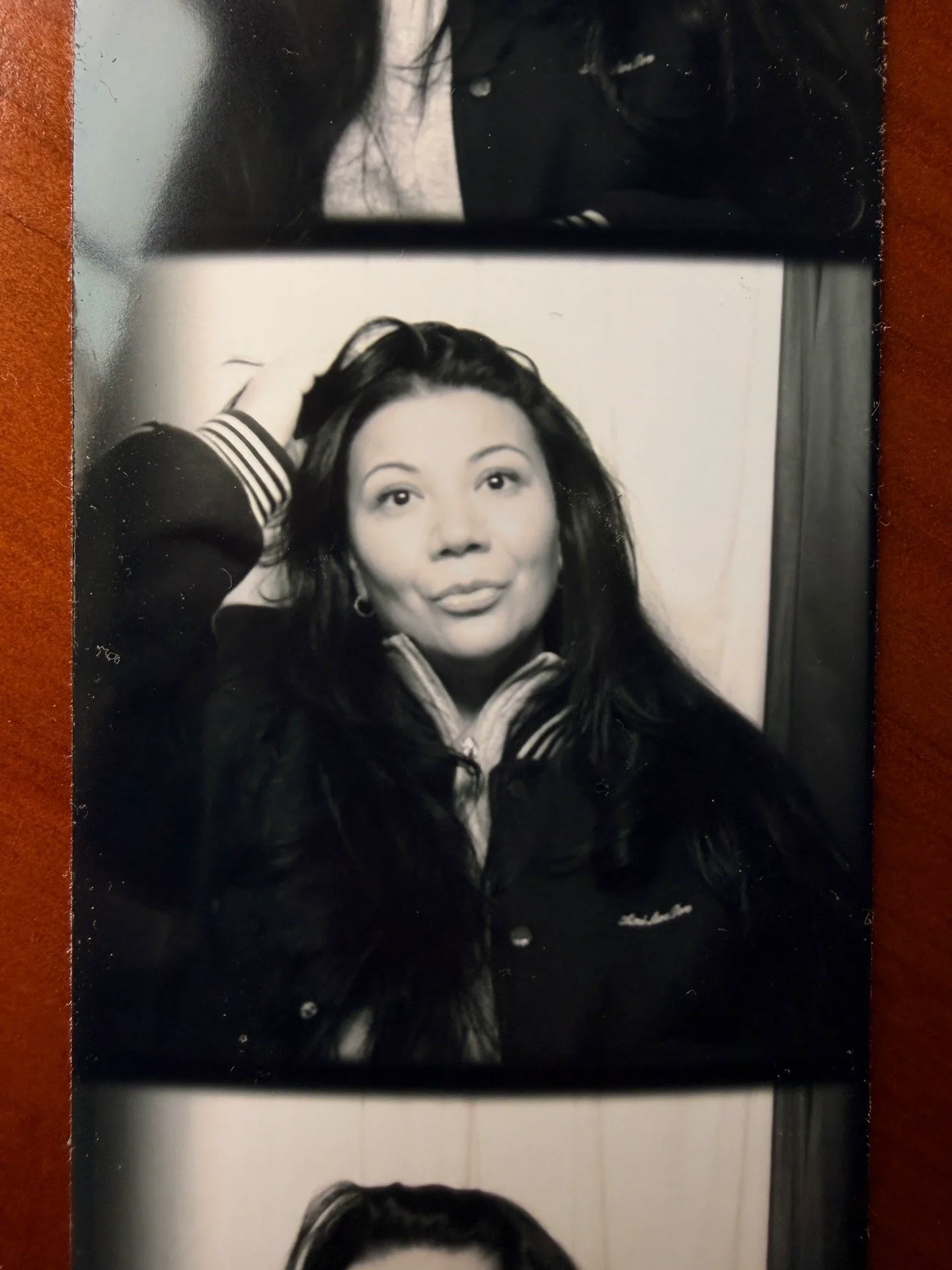
Portraits in black & white
People are photographed in monochrome. Grayscale portraits sit under soft Ink overlays so type stays readable and the focus stays on character, not colour.
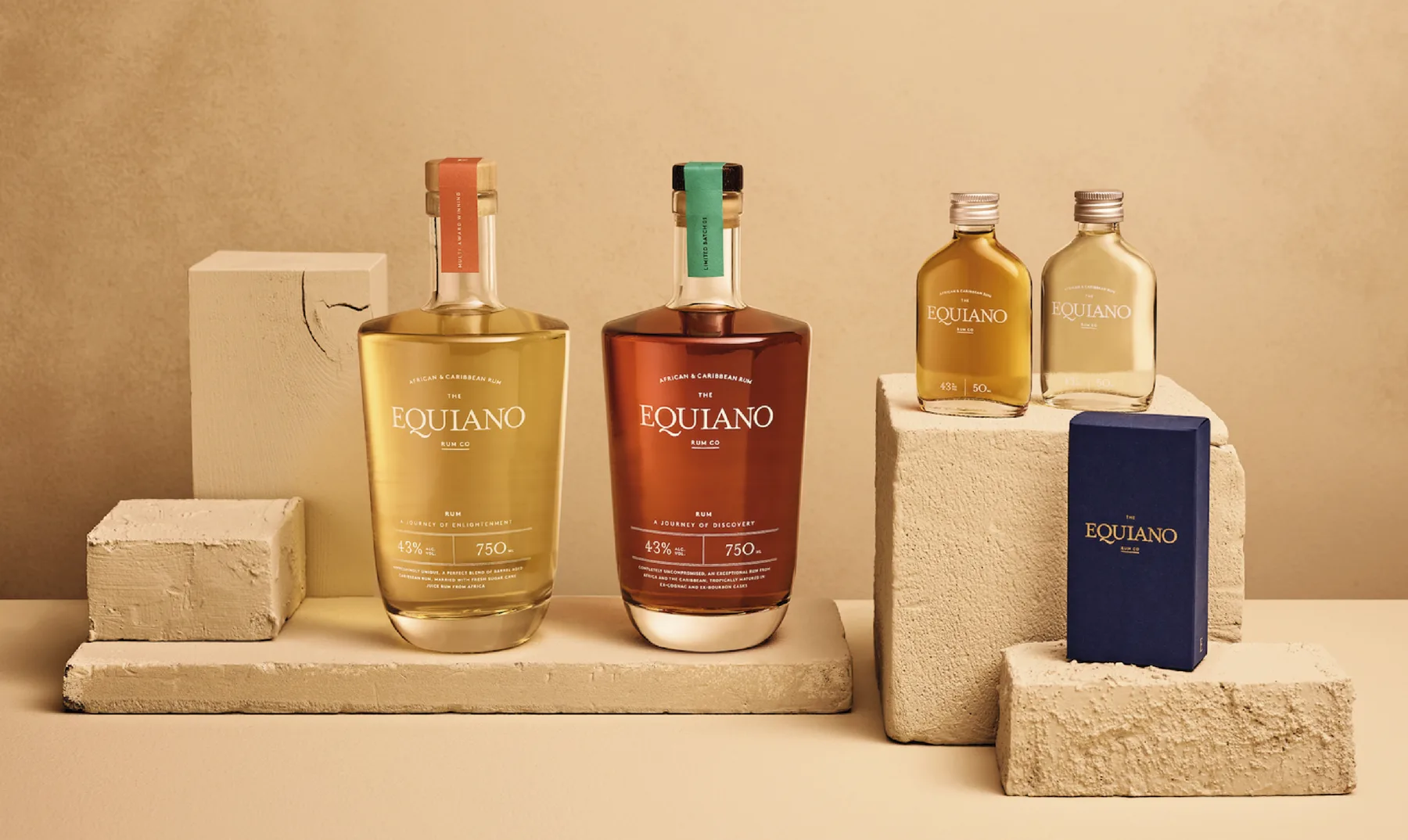
Tactile product photography
Packaging is shot on real materials — stone, wood, linen, greenery. Natural texture and daylight give the work a crafted, printed feel.
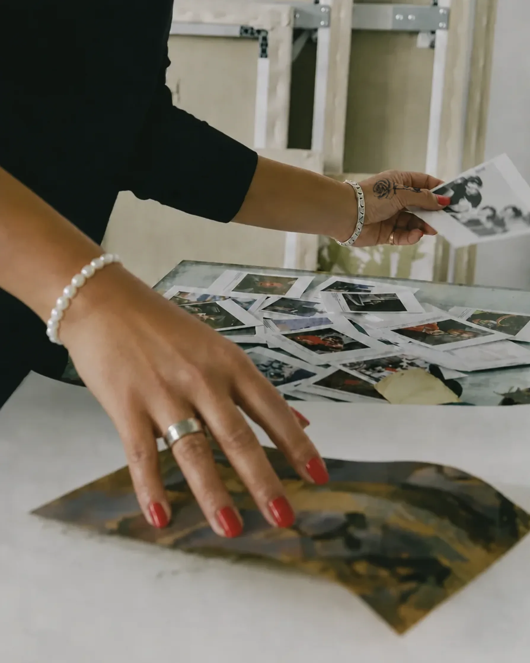
Process and making
Hands, studio tables, print proofs and works-in-progress show the craft behind the finished piece. Imperfection is welcome; nothing is over-polished.
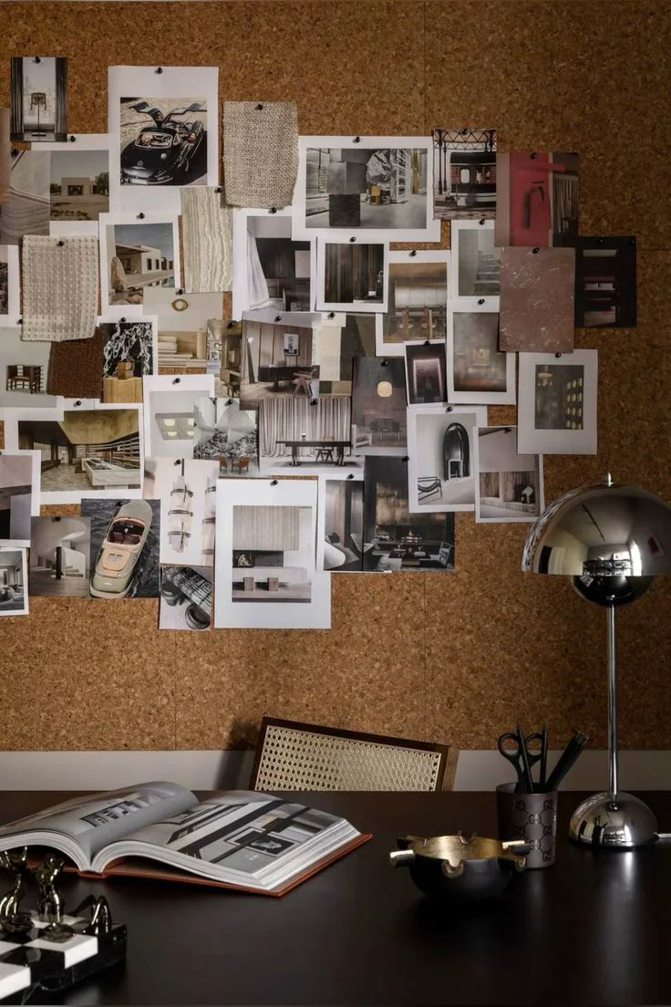
Editorial collage
Moodboards, clippings and layered references reflect the studio’s research-led process and its roots in culture, community and music.
Do
Shoot on real materials, in natural light, with people and process in frame.
Don't
Use sterile stock photography, heavy filters, or isolated products on pure white.
Cropping
Fill the frame edge to edge; let type sit directly on the image with a soft Ink overlay when needed.
/ Tone of voice
Warm, direct and human.
The studio writes the way it works: first person, plain English, generous and unpretentious. Sentences are short. Kindness and purpose come before polish.
Say
“Good design with more heart.”
Say
“Reach out about a project, collaboration or for a cuppa!”
Avoid
Jargon, corporate superlatives and design-speak. If it wouldn't be said over a cuppa, don't write it.
/ Interface elements
A small, consistent set of elements keeps every page feeling like one system.
Pill buttons.
Fully rounded, Medium weight, with a small arrow icon. Orange for primary actions.
Underline links.
Quiet text links use a simple bottom border instead of a button.
Micro labels.
Uppercase, wide-tracked xs labels mark sections, often prefixed with a “/” like a file path.